I was born in 1995 in São Paulo, grew up in the countryside and chose to study Graphic Design because of my interest in t-shirt prints at that time.
I ended up becoming a web dev and also working with football along the way.
At the age of 13, I had the curiosity of learning HTML and CSS, and over the course of these +10 years I expanded my knowledge and developed my skill on these and other practices/frameworks/languages that surround web development.
My background in Graphic Design naturally adds a critical eye to aesthetic and usability details during my productions, reducing the noise between design and programming which is very common - the thought of a layout and how it is actually developed.
Adequacy of Grupo Rações Reis' website to Wordpress in 2014, and since then providing support for changes, additions and general maintenance.
Layout designed by a third party
Check the website
Creation of structures and pages for the group's product lines, such as the Baw Waw Natural Pro landing page recently.
Layout designed by a third party
Check the landing page
Creation of pages for internal and external actions of the company, as recently the Bionexo Connections platform, which was developed using Laravel and has a login structure, voting system, organization of downloadable content, supports multiple languages and is accompanied by an administrator panel for content management and publishing.
Layout designed in conjunction with third party
Check the platform
Development of MC Software's website using Wordpress in 2017.
Check the website
Creation of structures to publicize the company's business units, such as the Informix Lab page recently.
Check the page
Development of Pan American Calcio's website using Wordpress in 2020.
Check the website
Even working mainly in areas that surround web development, my main degree is in Graphic Design, through a scholarship opportunity in the ESPM, completed in late 2016.
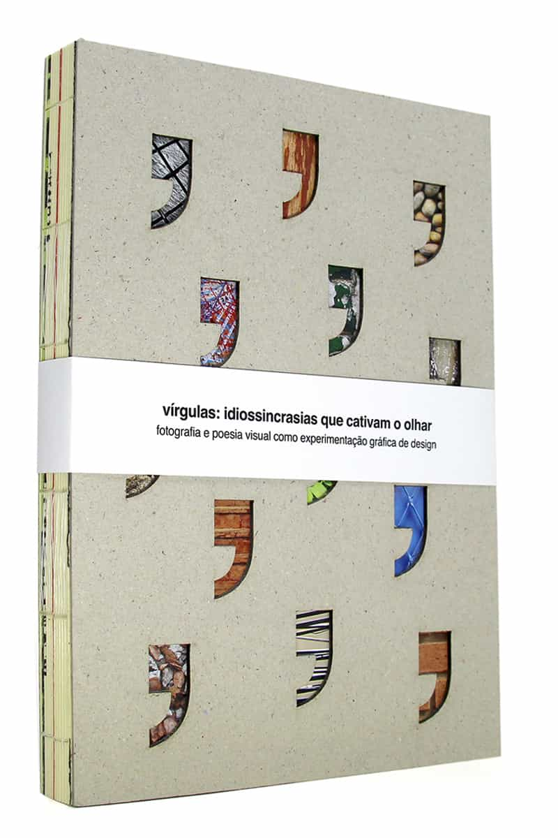
The monograph PDF is here, and the PDF of the book Figura por Figura here (only available in portuguese).
In the streets of São Paulo, we went out in search of what catches our eyes - peculiarities that capture attention to the point of causing a pause, a break, a hiatus, an interruption to observe, and or, register a certain scene – in short, what we call our "commas".
Next, interpretations of these images were performed, which resulted in experiments with visual poetry, and through it, it was portrayed, or explained, the motivation behind the photographic act and the message that the photograph carries in itself.
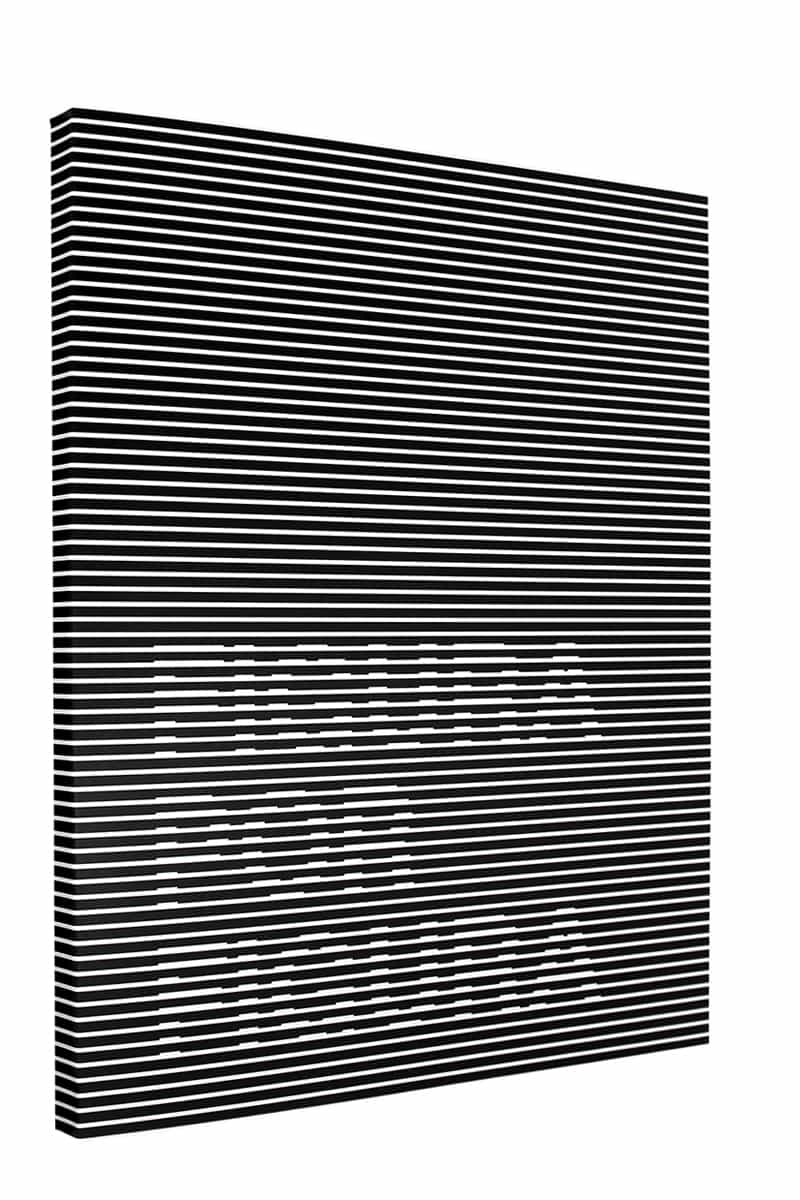
The expression of Photography as a visual interpreter of poetics, the path between a "comma" and Visual Poetry making the sensations in relation to the photographs collected tangible, as an exercise of perception and sensitivity, resulted in a book of experimental visual poetry "Figura por Figura".
Authors: André Martins e Felipe Chatah
Authors: André Martins, Felipe Chatah, Renata Pereira, Juliana Mavalli, Maisa Valfré
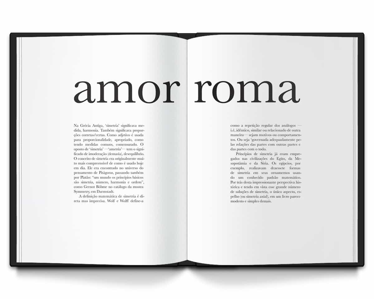
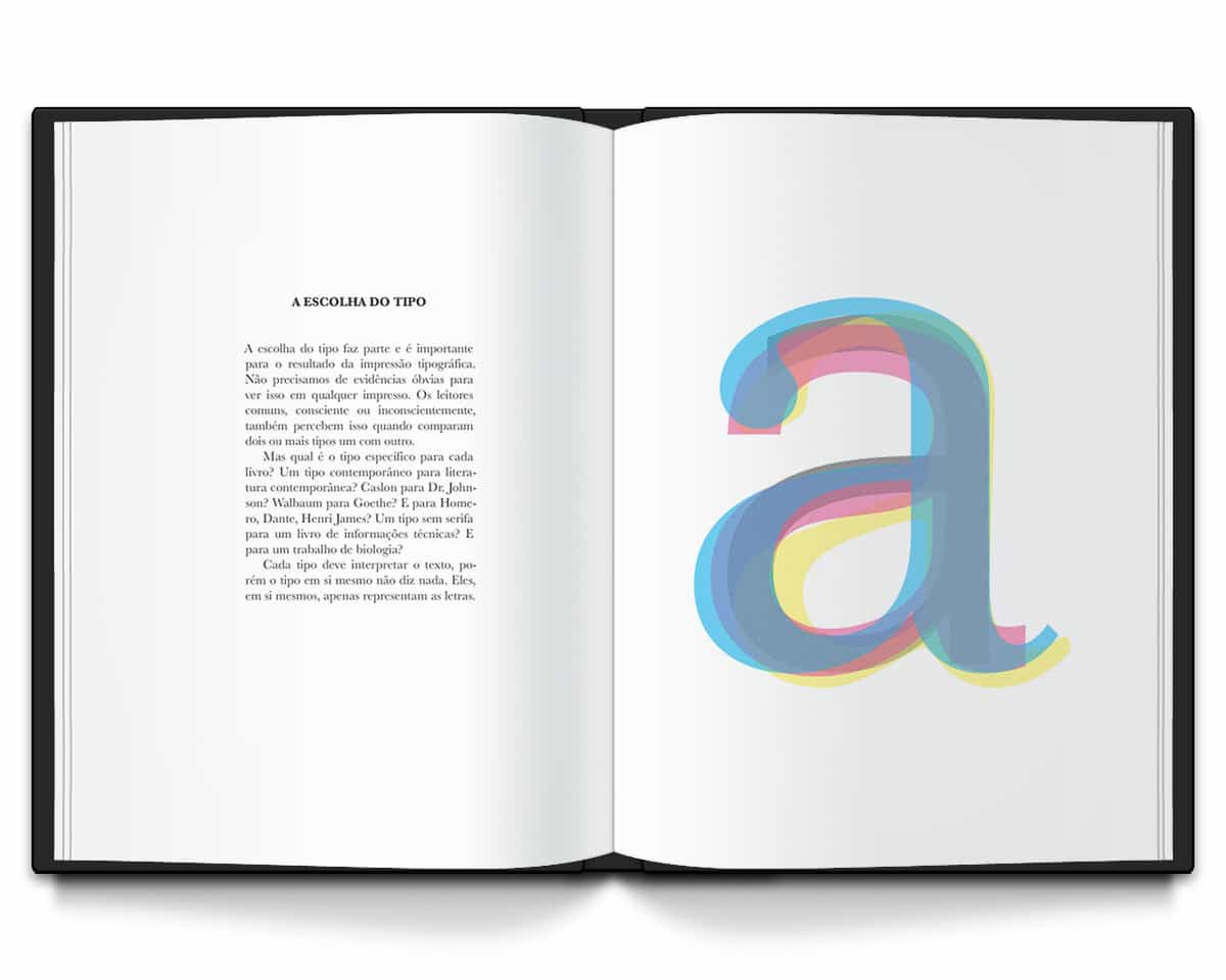
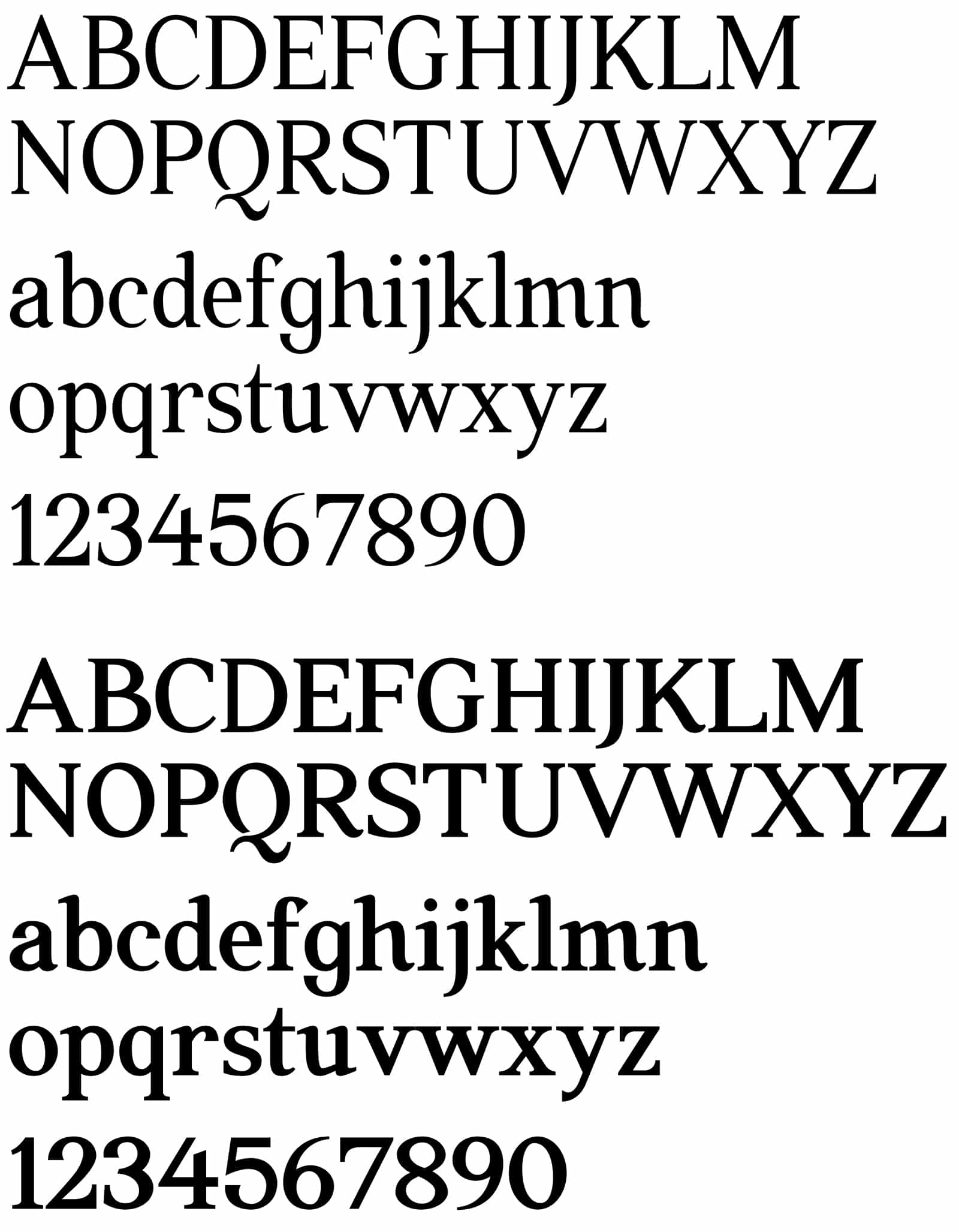
Quae is a Roman type with transitional serifs, pointed edges and good legibility in long texts, presenting a slightly condensed form of medium/book weight with a smooth humanistic axis, in addition to a medium contrast and "x" height.
It is an experimental project, so the font does not yet have several symbols and accents, so it is not recommended for actual use, but you can download it here.
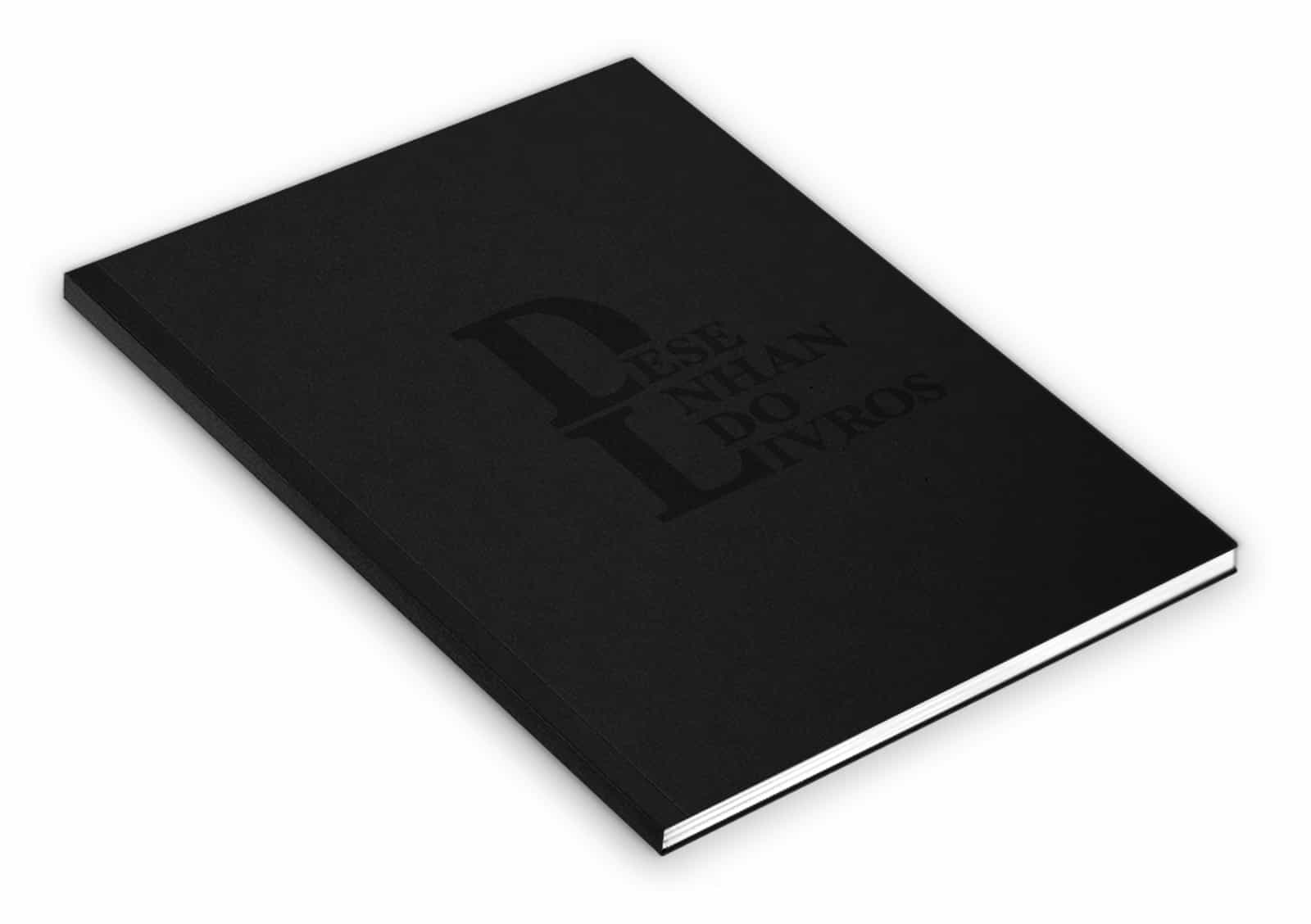
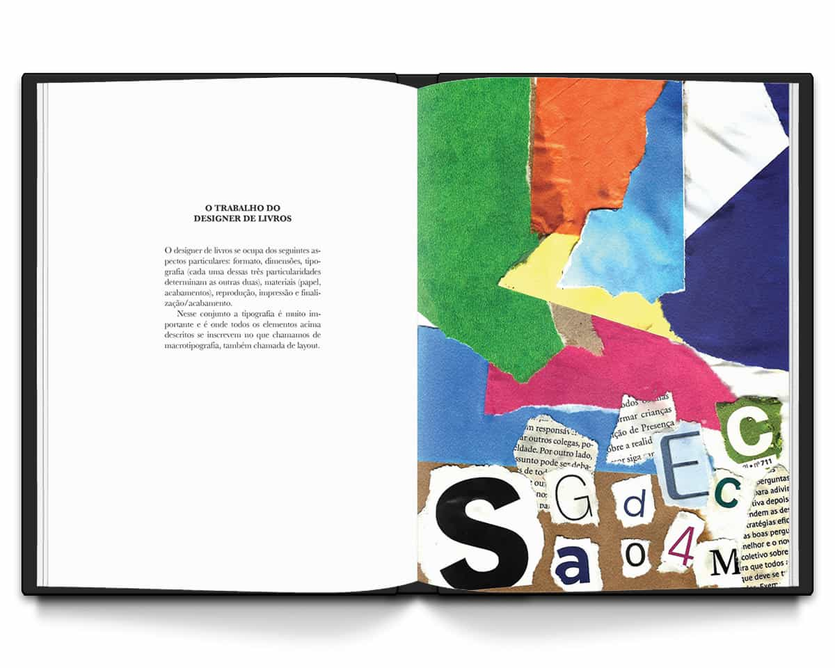
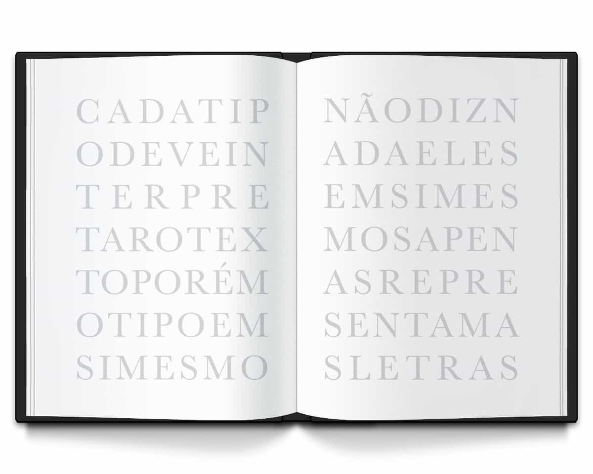
An experimental book "from designer to designer" developed from Jost Hochuli's text "Designing Books", using digital and manual techniques in a piece with a mostly artistic approach, with metaphorical graphic elements to represent typographic resources and concepts.
Authors: André Martins e Felipe Chatah
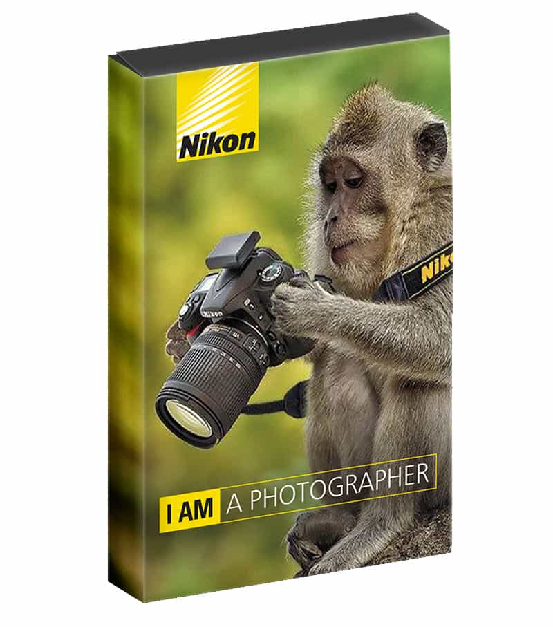
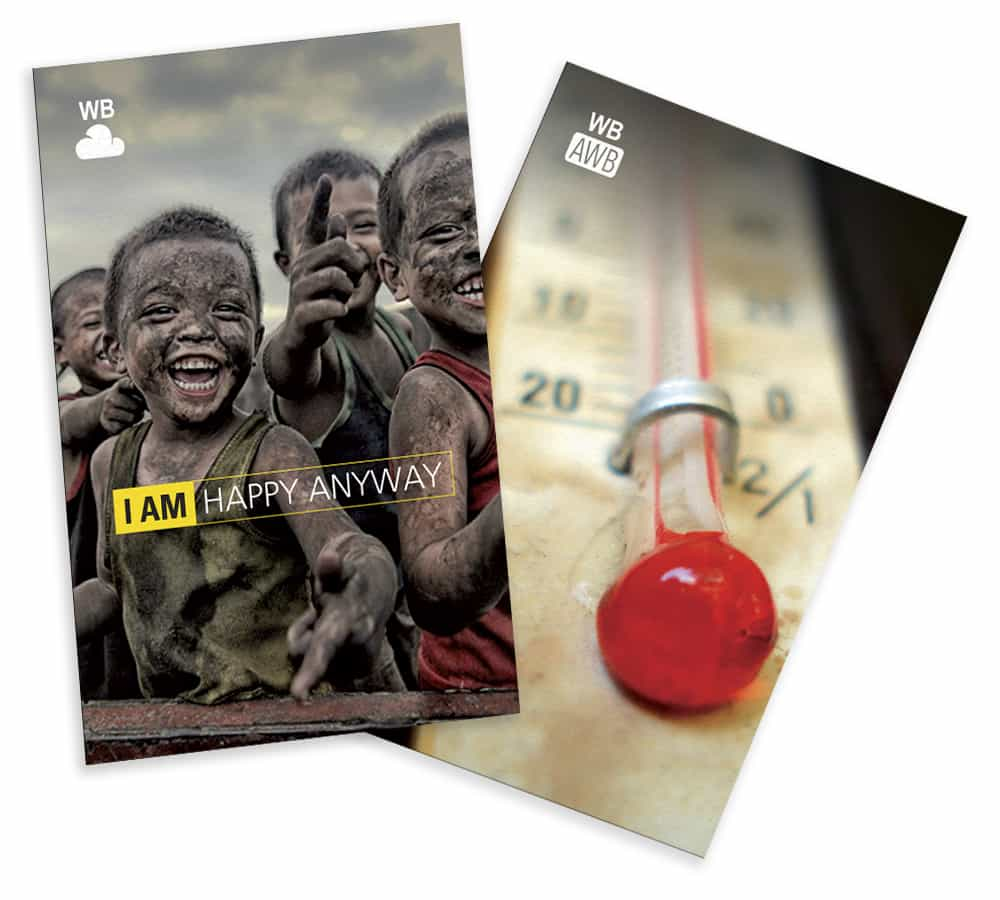
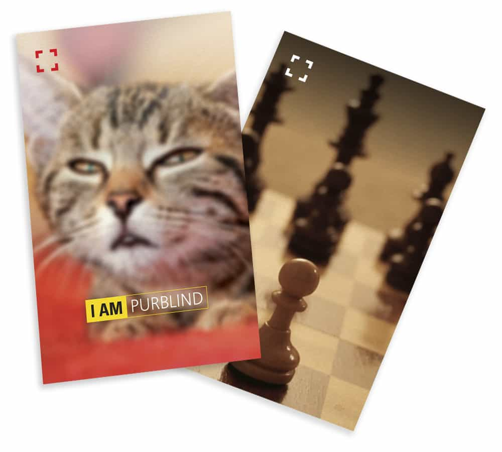
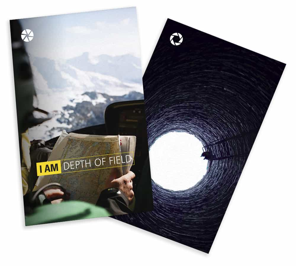
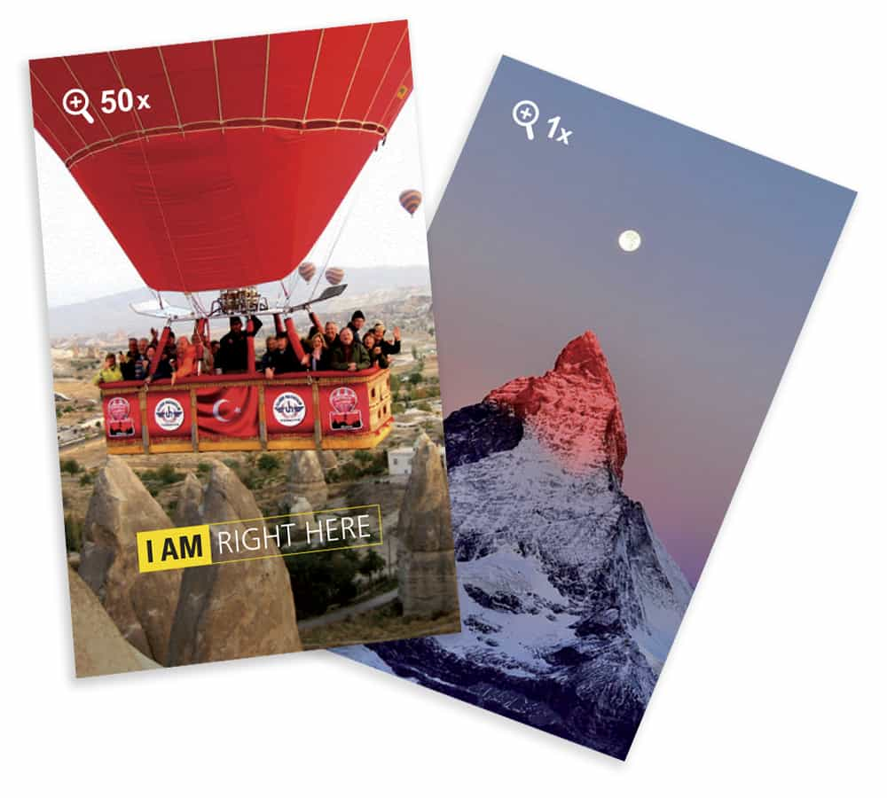
Game proposal for Nikon with the dynamics of Jogo do Mico (very popular children's game in Brazil), based on Nikon's new positioning in the compact camera business, having as its main influence the "I am Nikon" campaign, which aims to show that anyone can take pictures and capture the perfect moment.
What the game tries to propose is: yes, you can take pictures using the automatic mode of the camera, but you can also go deeper into the subject and learn a little more, understand about the manual functions and even become professional.
Based on these concepts, the graphic project was developed: the packaging had the role of representing the "I am Nikon" campaign, portraying the ease – automatic mode – of compact cameras, through the image of a monkey holding a camera, about to take a photo.
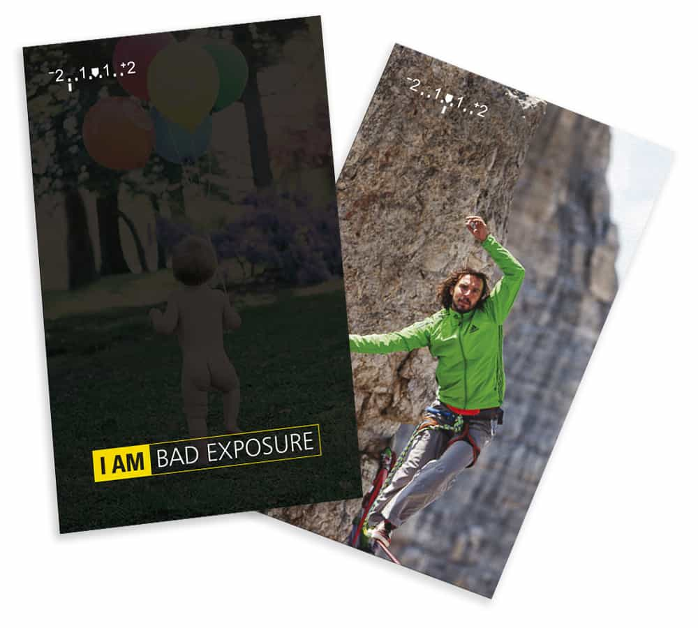
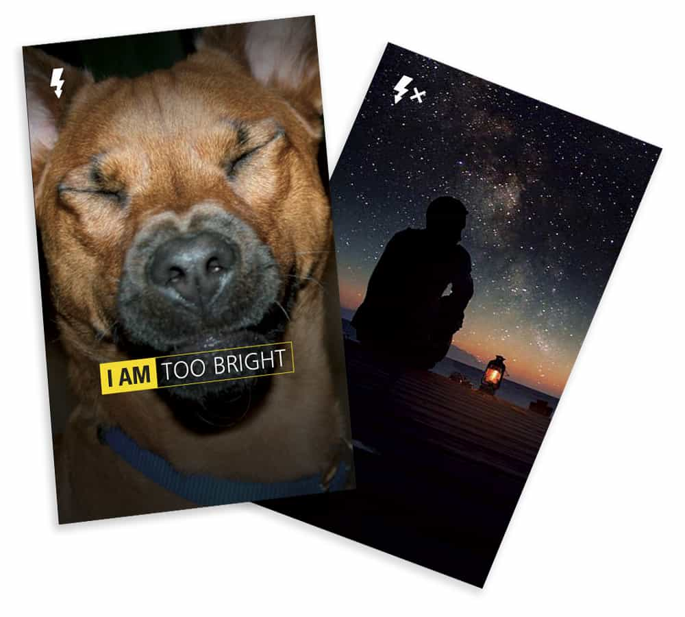
The game cards are responsible for addressing the depth of photography (manual mode) and they were produced as follows: one of the cards in the pair represents metaphorically, and or, ironically, a certain function in the manual mode, and its pair represents the effect this function has on the photograph.
Authors: André Martins e Felipe Chatah
Since 2018, I have been a partner of the Italian/American agency Pan American Calcio, with more than 5 years scouting in depth the regions of CONCACAF, CAF and CONMEBOL, while developing a strong overview of the market in these areas by talking regularly with club directors and scouts, who are part of a personal database with more than 400 direct contacts of club employees around the world – from the Americas to Africa.
I was able to follow closely, and or, participate directly in the negotiation and transfer of several athletes, mainly Caribbean and African, to European and North/Central American clubs, such as:
Abdul Rwatubyaye – The first Rwandan player to sign in any professional league in the Americas
Ashley Nazira – The first Mauritian player to sign in any United States professional league
Luis Paradela – The first Cuban athlete of any sport to sign professionally in the United States without defecting
(CNN -
AS -
Washington Post -
ISTOÉ -
The Athletic)